Ironhack final project: onboarding for a document intelligence API.
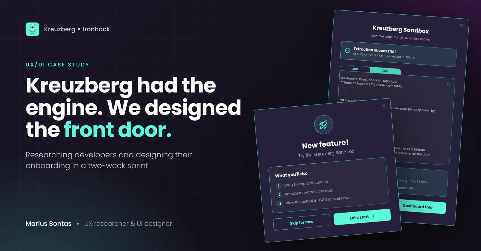
A platform ready to launch. An experience that didn't exist yet.
Kreuzberg pulls structured data out of documents through one API. Its managed service was about to go public with no login, no onboarding and no dashboard.
No designed path from sign-up to a first API call.
A trust-building landing page, guided onboarding, a sandbox and a project dashboard.
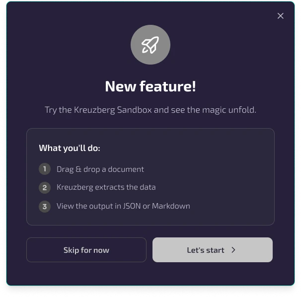
Interviews and synthesis. Onboarding modals, sandbox and the dashboard tour.
Technically strong. Experientially invisible.
Kreuzberg led on technical depth. Docling and Unstructured were winning on developer experience.
5 interviews with backend and full-stack developers, freelance and in-house.
Same story. Five times.
Three questions guided every interview. Tap a card to see what developers told us.
What makes a developer confident enough to commit to a new tool?
↻FlipDocs are the first trust signal.
Documentation quality decides before a single line of code is written.
Tap to flip backWhere do developers get stuck setting up a new API?
↻FlipGuesswork means goodbye.
When setup feels like guessing, developers leave, and rarely come back.
Tap to flip backWhat does it take to bring a tool back to the team?
↻FlipAdoption is never solo.
Developers have to prove the value to their team before they commit.
Tap to flip backHe doesn't want to be impressed. He wants to be convinced.
Evaluating document tools before the next sprint.
The problem wasn't the product. It was everything that should come after it.
…help developers get Kreuzberg's value in the first few seconds on the website?
…get Jarred to a working example in minutes, so he can check it fits?
…turn guided onboarding into confident, team-wide use?
Build the shortest path to the first API call.
Landing page
Earns trust in seconds with proof developers care about.
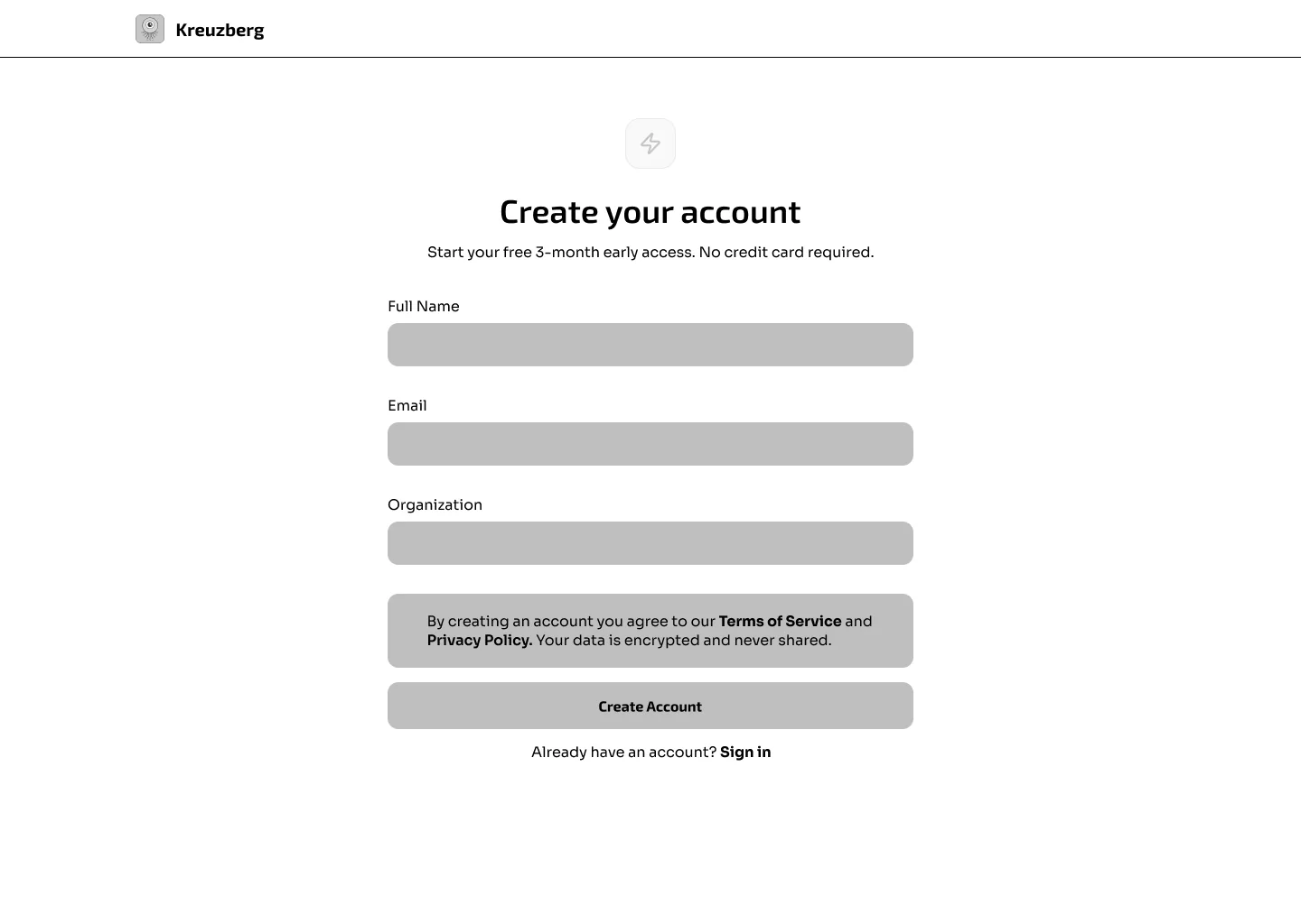
Onboarding flow
Quickstarts, copy-paste snippets and errors you can act on.
Project dashboard
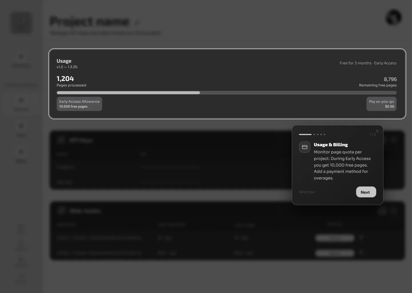
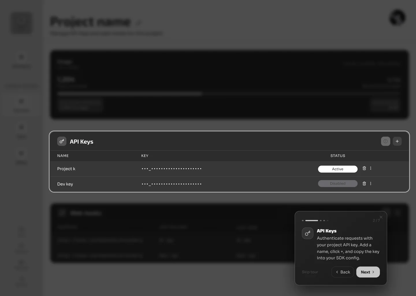
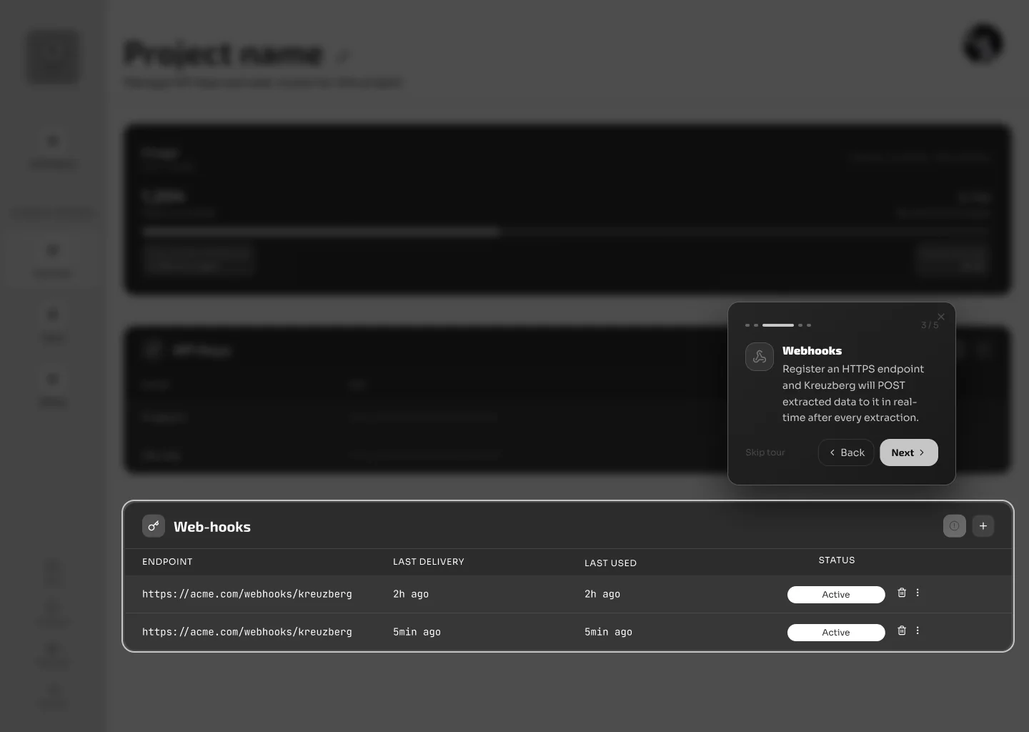
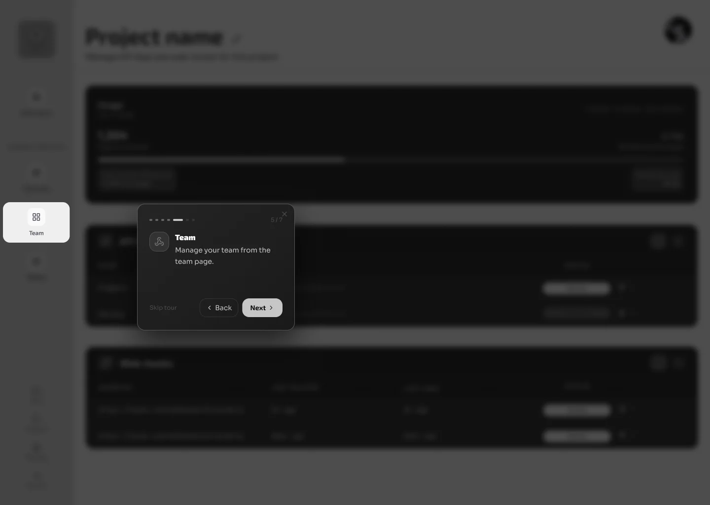
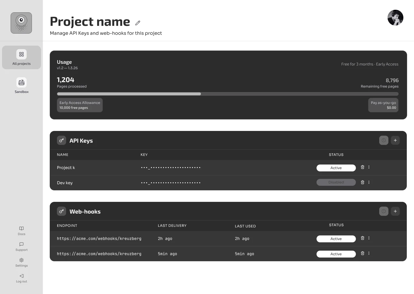
API keys, webhooks, team and docs in one place from day one.
The first two minutes, designed.
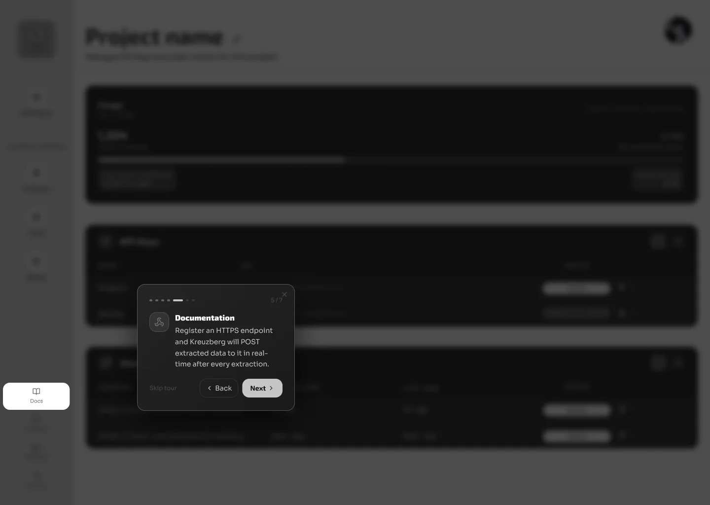
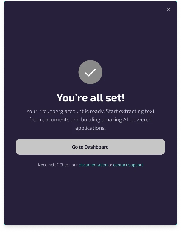
Our mid-fi prototype, from sign-up to dashboard. Screens marked My design are the onboarding modals, sandbox and guided tour I designed. Hover to pause.
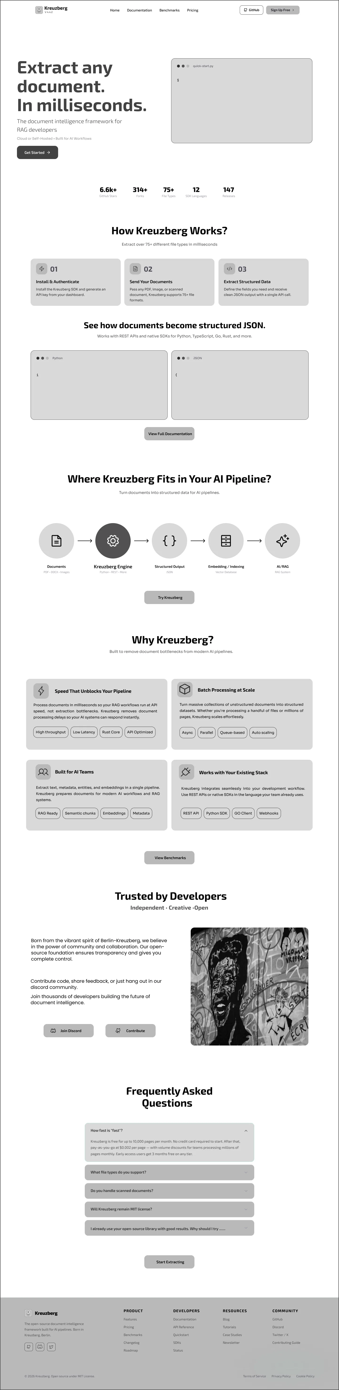
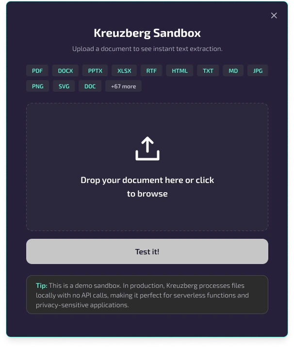
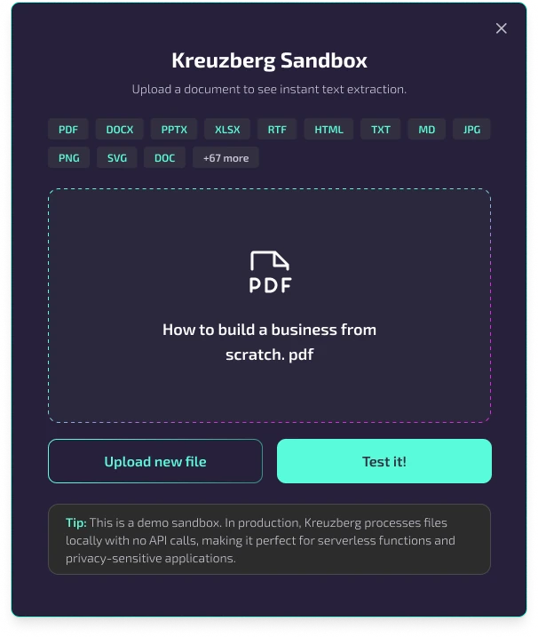
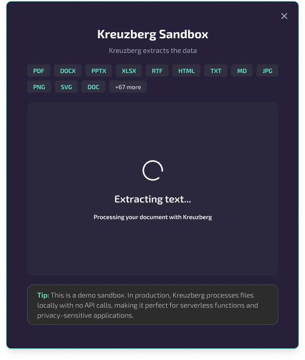
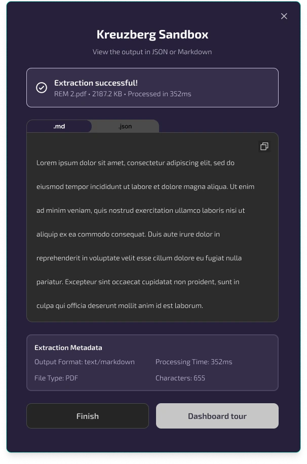
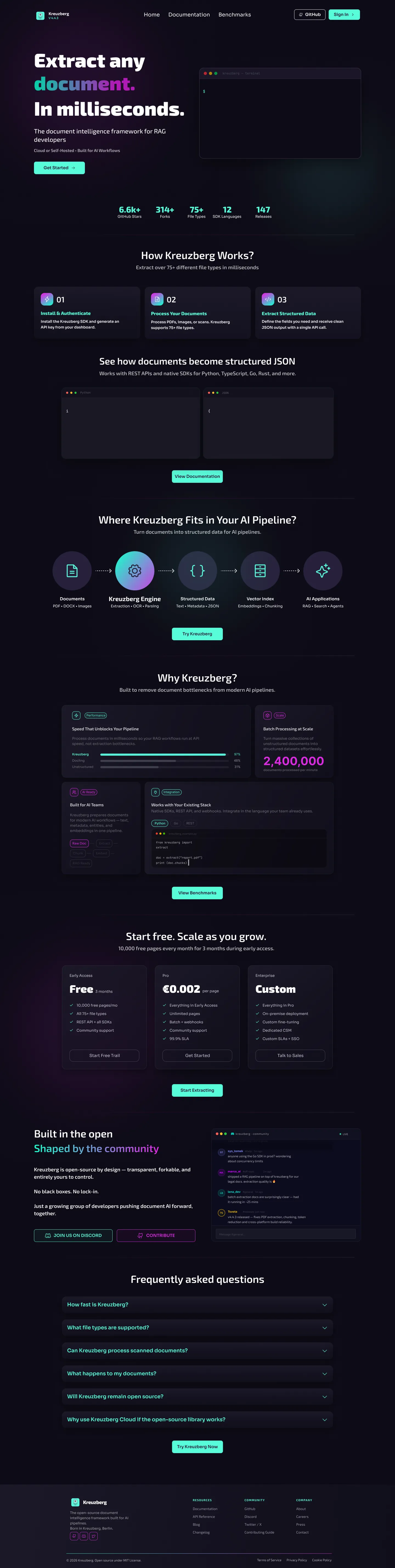
Landing page
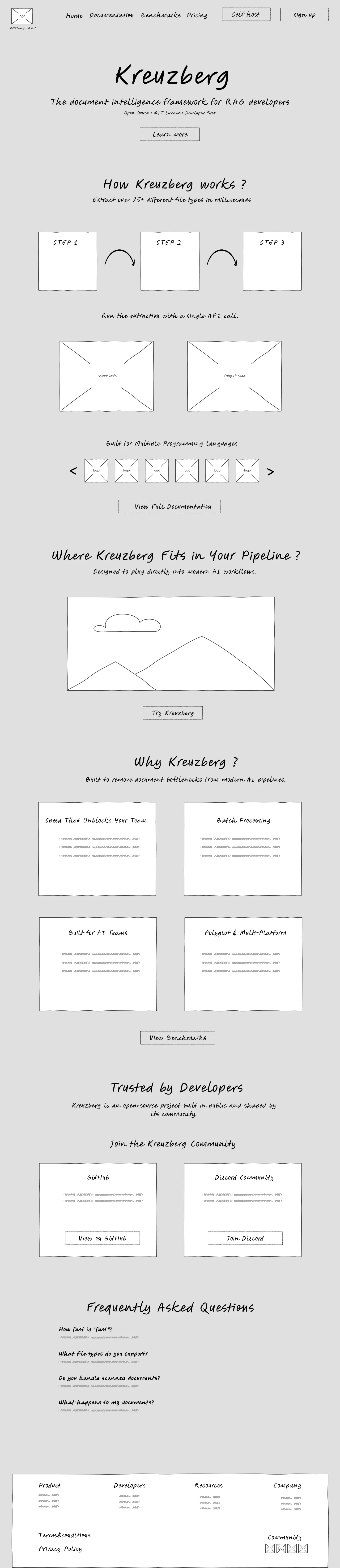
From sketch to hi-fi.
Drag the handle to see the onboarding tour I designed, from lo-fi sketch to hi-fi.
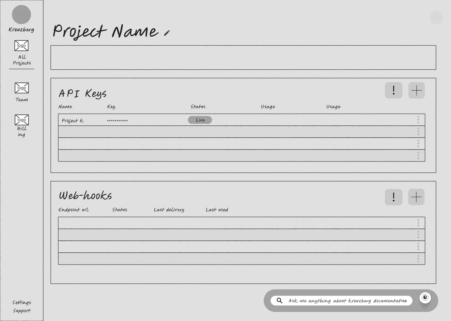
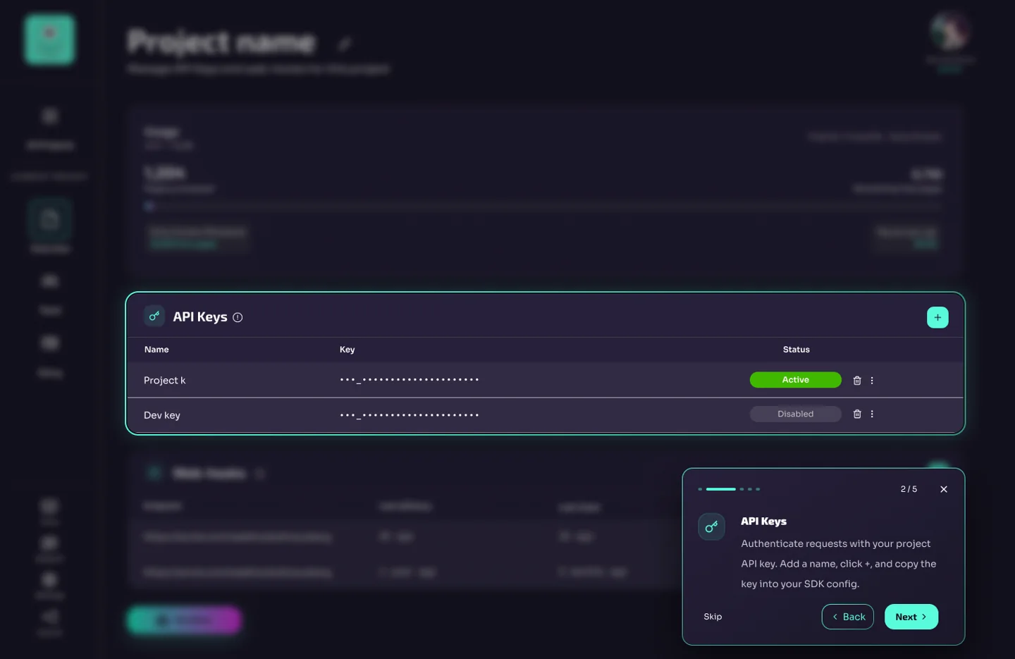 Lo-fi sketchHi-fi · my design
⟷
Scroll inside the frame, flip to compare.
- Dashboard earlier, guidance optional
- Clearer, more accessible
- Safer API keys, clearer feedback
- Sandbox moved next to API setup
- Google and GitHub login added
- Feedback: "smooth and intuitive"
- Validate with hi-fi testing
- Accessibility and responsiveness
- Explore an AI assistant
What I did, what was hard, how I got through.
Research + design
- Led and observed interviews
- Synthesised the findings
- Onboarding modals
- The sandbox
- Dashboard guided tour
The friction
- Developer jargon
- A two-week deadline
- Three designers, one consistent product
The fix
- AI tools
- Tight feedback loops
- A shared style guide in Figma
- Q&A with Kreuzberg's co-founder on the tech
Developers don't need hand-holding. They need the right information at the right moment.
The aha moment isn't a feature. It's confidence, earned through clarity.
Designing for trust means designing for transparency.
Most Engaging Presentation.
Final Project Award from the Ironhack UX/UI teaching team, for our work with Kreuzberg. Click the certificate to see it full size.